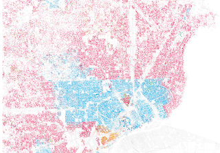
Eric Fischer saw those maps, and took it upon himself to create similar ones for the top 40 cities in the United States. Fisher used a straight forward method borrowed from Rankin: Using U.S. Census data from 2000, he created a map where one dot equals 25 people. The dots are then color-coded based on race: White is pink; Black is blue; Hispanic is orange, and Asian is green.
The results for various cities are fascinating: Just like every city is different, every city is integrated (or segregated) in different ways.
Washington, D.C., for example, has a stark east/west divide between white and black:
Detroit meanwhile, is marked by the infamous Eight Mile beltway, which serves a precise boundary for the city's black and white populations. Integration is almost non existent:
L.A
NY:
http://moourl.com/cities
http://www.flickr.com/photos/walkingsf/sets/72157624812674967/with/4981417821/


Aucun commentaire:
Enregistrer un commentaire